Your website’s homepage is like the front door to your online store. In the time it takes to blink, visitors decide whether to step inside or walk away. For businesses in the UAE, getting this first impression right is crucial. A great e commerce homepage design can be the difference between a forgotten shop and a booming business. If you’ve been wondering how to design an ecommerce website homepage in the UAE that truly connects with customers, you’re in exactly the right place.
Understanding the Role of a Homepage
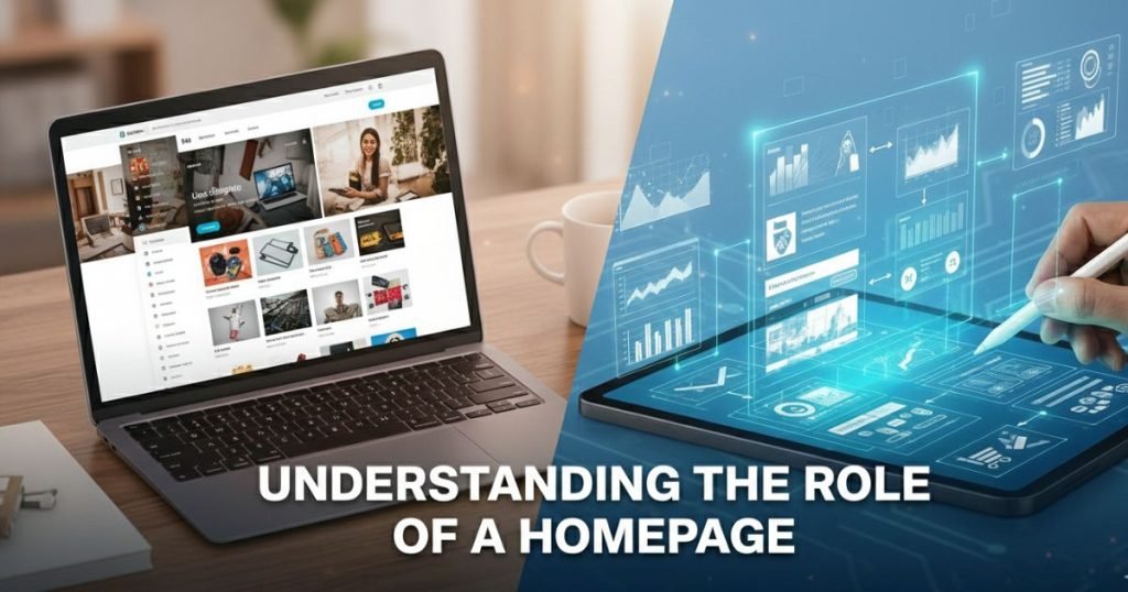
Think of your homepage as the grand entrance to your online store. It’s the first thing most visitors see, and it sets the stage for their entire shopping experience. Just like a friendly greeting at a physical shop, your homepage has the power to welcome customers, guide them around, and make them feel right at home. It’s more than just a pretty page; it’s a hardworking tool that can make or break a sale.
First impressions and their impact on conversions
You only get one chance to make a first impression, and online, that happens in about 50 milliseconds. That’s how quickly a user forms an opinion about your website. A cluttered, slow, or confusing homepage can send visitors clicking away before they even see your amazing products. A clean, engaging, and professional design, however, builds instant trust. This positive first step is crucial for turning a casual browser into a paying customer, directly impacting your conversion rates.
Key functions of an e-commerce homepage
Beyond looking good, your homepage has several important jobs to do. It needs to clearly communicate who you are and what you sell. It should guide visitors to key product categories, highlight promotions or bestsellers, and capture leads through a newsletter sign up. Essentially, your homepage acts as both a friendly guide and a smart salesperson, working 24/7 to create a seamless journey that encourages exploration and drives sales.
Essential Features of a High Converting Homepage
Creating a homepage that turns visitors into buyers isn’t magic; it’s about having the right pieces in the right places. Let’s look at three must have features that make shopping a breeze and boost your sales.
Clear and intuitive navigation
Imagine walking into a giant supermarket with no aisle signs. Frustrating, right? That’s what a website feels like without good navigation. Your menu needs to be simple and organized so shoppers can find exactly what they want in seconds. Stick to clear categories like “Men,” “Women,” or “Sale,” and place your search bar where it’s impossible to miss. When users don’t have to guess where to click, they stay longer and buy more.
Prominent call to action buttons
Your customers need a little nudge in the right direction. That’s the job of your Call to Action (CTA) buttons. These are the buttons that say “Shop Now,” “View Deal,” or “Add to Cart.” Make them pop with contrasting colors that stand out from the rest of your design. Don’t be shy, place them front and center on your banners. A strong, clear button tells your visitor exactly what to do next, removing hesitation from the buying process.
High quality visuals and product showcases
In the online world, customers can’t touch or try on your products. Your photos have to do the heavy lifting. Use crisp, high-definition images that show off details and textures. A blurry photo signals poor quality, even if the product is amazing. Feature your best items in a slider or a “Trending Now” section right on the homepage. Great visuals build desire instantly, making users feel confident that they are buying something worthwhile.
Design Best Practices for the UAE Market
To truly succeed in the UAE, your homepage needs to speak directly to the local audience. A generic design just won’t cut it. Connecting with customers means understanding what they value, how they shop, and what makes them feel secure. Let’s explore how to tailor your design for this unique market.
Incorporating cultural and regional preferences
Shoppers in the UAE often appreciate a touch of luxury and clean, modern aesthetics. Think elegant fonts, high end imagery, and a color palette that feels sophisticated. It’s also smart to be mindful of cultural sensitivities. For instance, using respectful imagery during religious holidays like Ramadan shows that your brand understands and values local traditions. This small effort helps build a strong, positive connection with your audience.
Highlighting local payment options
Trust is a huge factor in online shopping. One of the best ways to build it is by offering familiar and trusted payment methods. While credit cards are common, many shoppers in the UAE still prefer options like Cash on Delivery (COD) or local payment gateways like PayTabs and Telr. Highlighting these options clearly on your homepage, perhaps with small logos in the footer, instantly tells customers that you cater to their needs and are a credible local business.
Using Arabic and English language options effectively
The UAE is a diverse, multicultural hub. Providing your website in both Arabic and English is not just a nice to have; it’s a must. Add a simple language switcher at the top of your homepage that is easy to find. This small feature makes your site accessible to a much wider audience, ensuring that everyone feels welcome and can shop with ease, no matter their preferred language.
Advanced Features to Enhance User Experience

Once you have the basics down, it’s time to sprinkle in some magic. Modern shoppers in the UAE are tech savvy and expect a smooth, almost intuitive experience. Adding a few advanced features can turn a good homepage into a great one, keeping visitors engaged and coming back for more.
AI driven personalization
Imagine walking into a shop where the assistant knows exactly what you like. That’s what Artificial Intelligence (AI) does for your website. Instead of showing everyone the same thing, AI tools analyze what a visitor has looked at before. If a customer loves sneakers, your homepage can automatically show them the latest kicks instead of formal shoes. This personal touch makes shoppers feel understood and special, which significantly boosts the chance of them clicking “Buy.”
Seamless checkout process with minimal steps
Nothing kills a sale faster than a complicated checkout. If a customer has to fill out ten different forms just to buy a t shirt, they might just give up. A smart homepage design often includes a “Quick View” or “Add to Cart” button right on the product images. Even better, allow customers to check out as “guests” without forcing them to create an account first. By reducing the number of clicks from the homepage to the final payment, you make spending money easier and faster.
Integration with social commerce platforms
Let’s face it: everyone is on social media. Your homepage shouldn’t be an island; it needs bridges to where your customers hang out. Integrating your Instagram or Facebook feed directly onto your homepage adds fresh, colorful content instantly. Plus, with social commerce, users can see a product on your Instagram feed and click straight through to buy it. It connects your social buzz with your sales, creating a lively and modern shopping vibe.
SEO and Marketing Integration
Building a beautiful homepage is only half the battle; people still need to find it. That’s where SEO (Search Engine Optimization) and marketing come into play. Think of it like putting up signposts all over the city pointing to your new shop. Without them, even the best store might stay empty. Let’s look at how to get your site noticed in the busy UAE market.
Optimizing the homepage for local search terms
When people in Dubai or Abu Dhabi search for products, they often use specific words. Instead of just “best running shoes,” they might type “buy running shoes Dubai” or “sneakers delivery UAE.” To capture this traffic, you need to sprinkle these local keywords naturally into your homepage headlines and product descriptions. It tells search engines like Google, “Hey, I’m right here in the neighborhood!” This simple step helps connect you with shoppers who are ready to buy and are close by.
Using structured data for better visibility
This sounds technical, but it’s actually quite simple. Structured data is just a way of organizing information so search engines understand it better. It’s like putting clear labels on your jars. When you use it correctly, Google can show extra details right in the search results, like star ratings, prices, or whether an item is “In Stock.” These little extras make your listing stand out from the crowd and give customers confidence before they even click.
Integrating analytics to track user behavior
You can’t fix what you don’t measure. Integrating tools like Google Analytics is like installing a security camera that tells you how people shop. You can see where visitors click, how long they stay, and where they get stuck. If everyone leaves after seeing the shipping costs, you know exactly what to change. These insights are pure gold, helping you tweak your homepage to keep customers happy and sales flowing.
Common Mistakes to Avoid
Even the best intentions can lead to messy results if you aren’t careful. Building a homepage is exciting, but it’s easy to stumble into common traps that scare customers away. Let’s look at three big mistakes to dodge so your online store stays welcoming and profitable.
Overloading the homepage with information
We get it, you’re proud of your products and want to show everything off at once. But jamming every single item, banner, and text block onto the homepage is like shouting at your visitors. It’s overwhelming! A cluttered page confuses people, and confused people don’t buy things. Instead, think of your homepage as a highlight reel. Pick your best offers, a few top categories, and one clear message. Give your content some breathing room (white space) so shoppers can actually focus on what matters.
Ignoring mobile first design principles
Here in the UAE, almost everyone shops on their phone. If your site looks great on a laptop but is a nightmare to use on a mobile screen, you are losing sales. Buttons that are too small to tap, text that requires zooming in, or images that take forever to load will send customers running to your competitors. Design for the smallest screen first. Ensure your menu is easy to tap with a thumb and that scrolling feels smooth and natural.
Using generic templates without customization
Using a pre made template is a great way to start, but leaving it exactly as it came out of the box is a mistake. If your store looks identical to five other shops, why should customers remember you? A generic look lacks personality and trust. You don’t need to reinvent the wheel, but you do need to add your own flavor. Use your brand’s colors, unique photos, and a voice that sounds like you. Make it feel like a real business, not just another copy paste website.
Future Trends in Ecommerce Homepage Design
The world of online shopping moves fast, and staying ahead of the curve is the secret to staying in business. What works today might feel old fashioned tomorrow. To keep your UAE customers excited and coming back for more, you need to look at what’s coming next. Let’s peek into the crystal ball and see three trends that are changing the game.
Voice search optimization
“Hey Google, find me a red dress in Dubai.” More and more people are using their voices instead of their fingers to shop. It’s faster, easier, and hands free. To get ready for this, your homepage needs to understand how people actually talk. Instead of just keywords like “red dress,” your site should be ready to answer questions like, “Where can I buy a red dress near me?” Making your content sound natural, like a real conversation, helps these voice assistants find you and bring customers straight to your door.
Augmented reality (AR) for product previews
Buying furniture or makeup online used to be a guessing game. Will that sofa fit? Is that lipstick too bright? Augmented Reality (AR) fixes this by letting customers “see” products in their own space through their phone cameras. Imagine pointing your phone at your living room and seeing exactly how a new lamp would look. Adding a simple “View in My Room” button to your homepage highlights doesn’t just look cool; it builds huge confidence and stops returns before they happen.
Sustainability focused design elements
Shoppers in the UAE are becoming more eco-conscious every day. They want to buy from brands that care about the planet. Your homepage is the perfect place to show your green side. Use badges to highlight eco-friendly products, sustainable packaging, or carbon neutral shipping. Even using a “Dark Mode” option can save energy on mobile screens! Being open about your values isn’t just a trend; it’s a way to connect deeply with customers who want to make a difference with their wallets.
FAQs
Why is a mobile friendly design critical for e-commerce in the UAE?
In the UAE, people are glued to their phones! Most shoppers browse and buy while on the go. If your site looks messy on a small screen or buttons are too tiny to tap, visitors will leave instantly. A mobile friendly design ensures your shop looks perfect and works smoothly on any device, keeping those customers happy and buying.
How can I integrate local payment gateways into my e-commerce website?
Adding local payment options like PayTabs or Telr is easier than you think. Most ecommerce platforms like Shopify or WooCommerce have plugins or apps for these services. You simply sign up with the provider, install their plugin, and enter your details. It’s like plugging in a new appliance, once it’s connected, you’re ready to accept payments securely!
What are the best practices for designing a bilingual e-commerce homepage?
To welcome everyone, offer both Arabic and English. Use a clear language switcher at the top of the page. Ensure your design supports “Right to Left” (RTL) text for Arabic so it reads naturally. Keep the layout clean so switching languages doesn’t break your design. It shows respect and makes shopping easy for everyone.
How do I ensure my homepage loads quickly for UAE users?
Speed is everything! To make your site fly, compress your images so they look good but don’t take up much space. Use a good hosting provider with servers near the UAE. Also, avoid using too many heavy videos or animations that slow things down. A fast site equals happy customers and better Google rankings.
What are the key trust signals to include on an ecommerce homepage?
Trust is the foundation of sales. Display clear contact information, like a local phone number and address. Show off customer reviews and star ratings. Include security badges (like “Secure Checkout”) and logos of payment partners. These small signs tell visitors, “We are real, safe, and reliable.”
Conclusion
We’ve covered a lot of ground together! Building the perfect online store might feel like a big project, but with the right plan, it’s completely doable. You now have the roadmap to create a homepage that doesn’t just sit there but actually works hard for your business.